


The market research, including legislation, news, and scholarly articles surrounding menstruation, that I gathered on the internet helped me to gain a better understanding of the customers’ needs and preferences.
Through the extensive market deep dive, the market size of menstrual care products was found to be 24.8 billion↗. Despite the substantial market size, the current infrastructure fails to fulfill consumers’ demands.
Because menstruation needs and preferences are so diverse, women are forced to be constantly prepared with their own products, which are often bulky and indiscreet. When caught unprepared, in a moment of unneeded stress and humiliation, go-to solutions are to ask a nearby friend or stranger, make a substitute (e.g. wadding toilet paper), or run to a convenience store. Each of these solutions is impractical and uncomfortable.
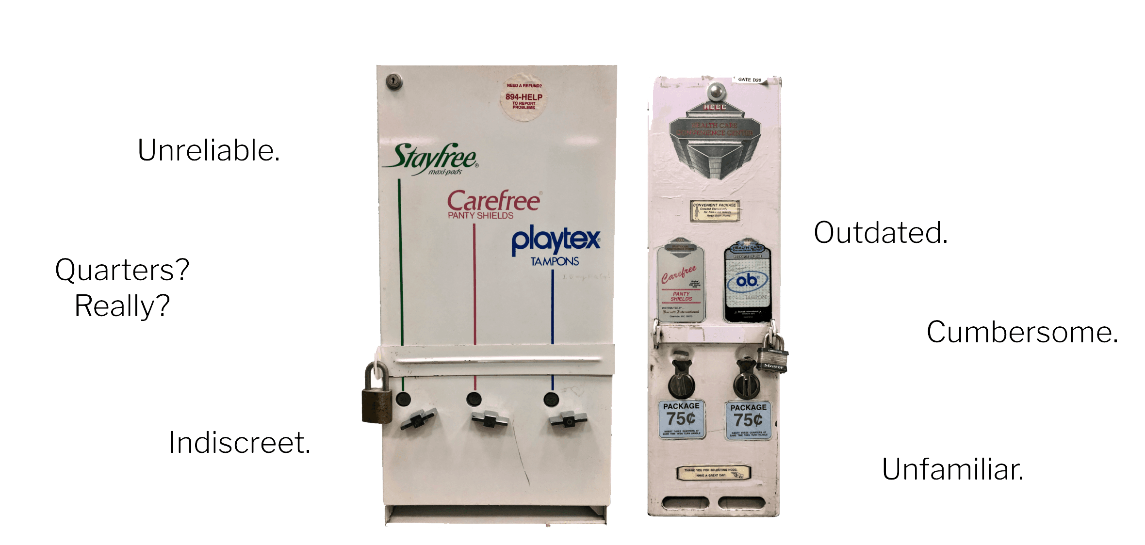
If a dispenser happens to be in a bathroom, it’s jammed; if it’s not jammed, it’s not even stocked; and for those who hit the period powerball with a dispenser that actually vends, the product is never a first, second, or tenth choice.
In addition, existing feminine hygiene product dispensers do not meet the needs or preferences of people who menstruate. Apart from derelict appearances, their clunky interface intimidates people in a pinch and heaps stress onto an already embarrassing situation.
Current Solution
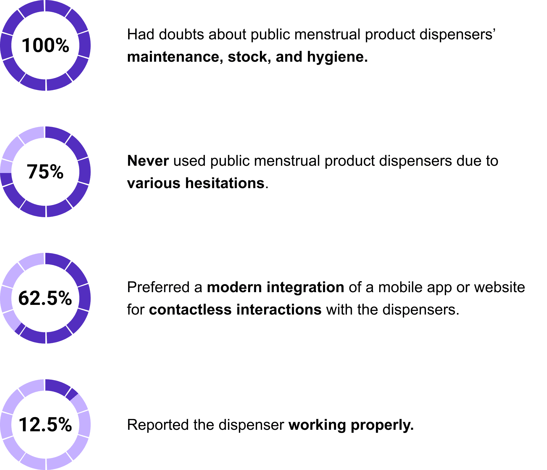
I chose to target people who menstruate as the primary consumers of Strapt. I conducted 30-minute user interviews with eight people who menstruate across various demographics—from college students and young professionals to nurses and teachers—who have all acquiesced to the state of infrastructure for menstrual hygiene. The interviews were held over the span of a week and through various formats based on the interviewee’s preferences— Zoom meetings, phone calls, and in-person interviews. Those interviews yielded firsthand horror stories of cumbersome, unstocked dispensers that could not help in a critical moment.
After conducting interviews, I wrote down notes and organized users’ goals, expectations, and pain points. I discovered many similarities that users have faced when in a pinch. I grouped the qualitative data to develop a persona and used the persona and takeaways to populate a user journey map to depict the user experience of the menstrual product dispensers in the public space. The journey map helped me to gain insight into how a customer interacts with the dispensers and what they might find helpful or frustrating.
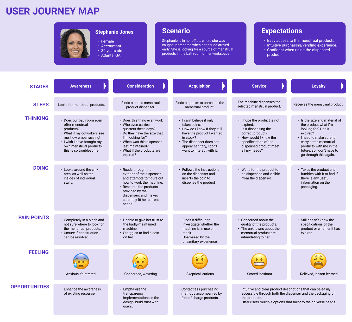
User Journey Map
To conclude my research, I used the outcomes from the user journey map to create How might we (HMW) questions that kickstarted the development of creative ideas for the product.

How might we cater to individuals’ menstruation needs?
How might we create an intuitive, transparent, and reliable interaction scheme?
How might we display the guarantees of product and stock security?
How might we integrate contactless user interaction and secure, cashless payment?
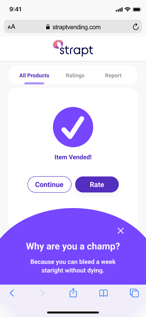
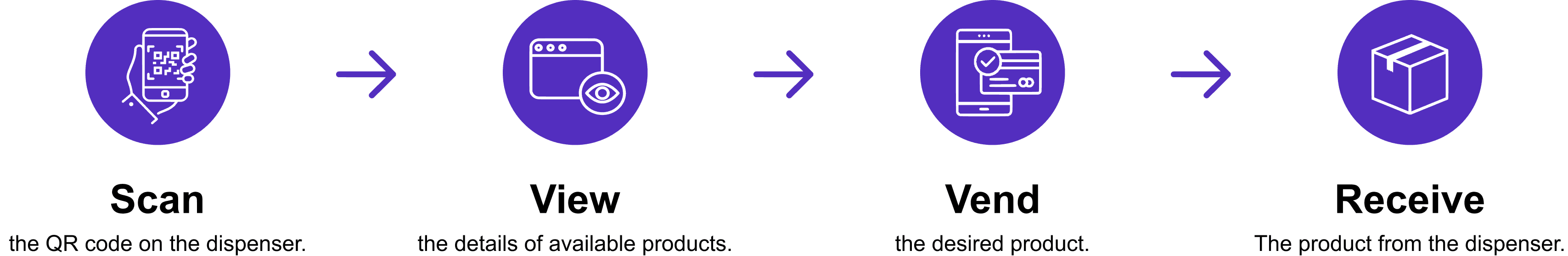
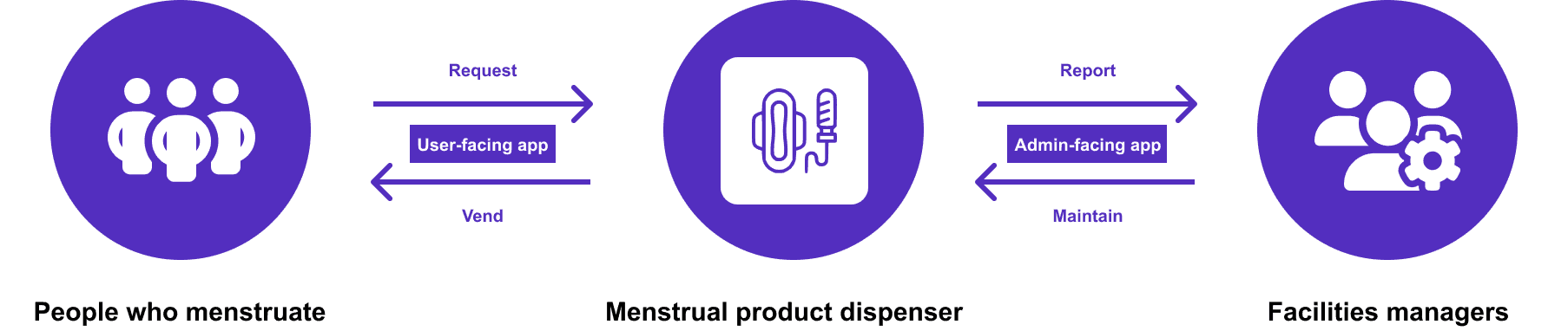
The user interviews and research synthesis helped me to better understand the problem beyond available news and research. The data and insights from these processes have revealed the true pains for people who menstruate and the opportunity to create a contactless, intuitive, and quick vending experience. I analyzed these pain points and findings and brainstormed a 4-step mobile app solution to complement the physical dispensers developed by Strap.
This solution was made possible through the work of the electrical engineers on the team, who implemented Internet of Things (IoT) technology on the dispensers to create a secure connection between users’ mobile devices and the dispensers.
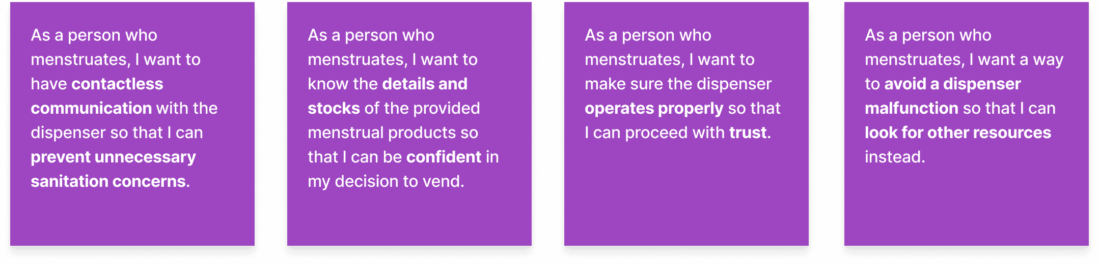
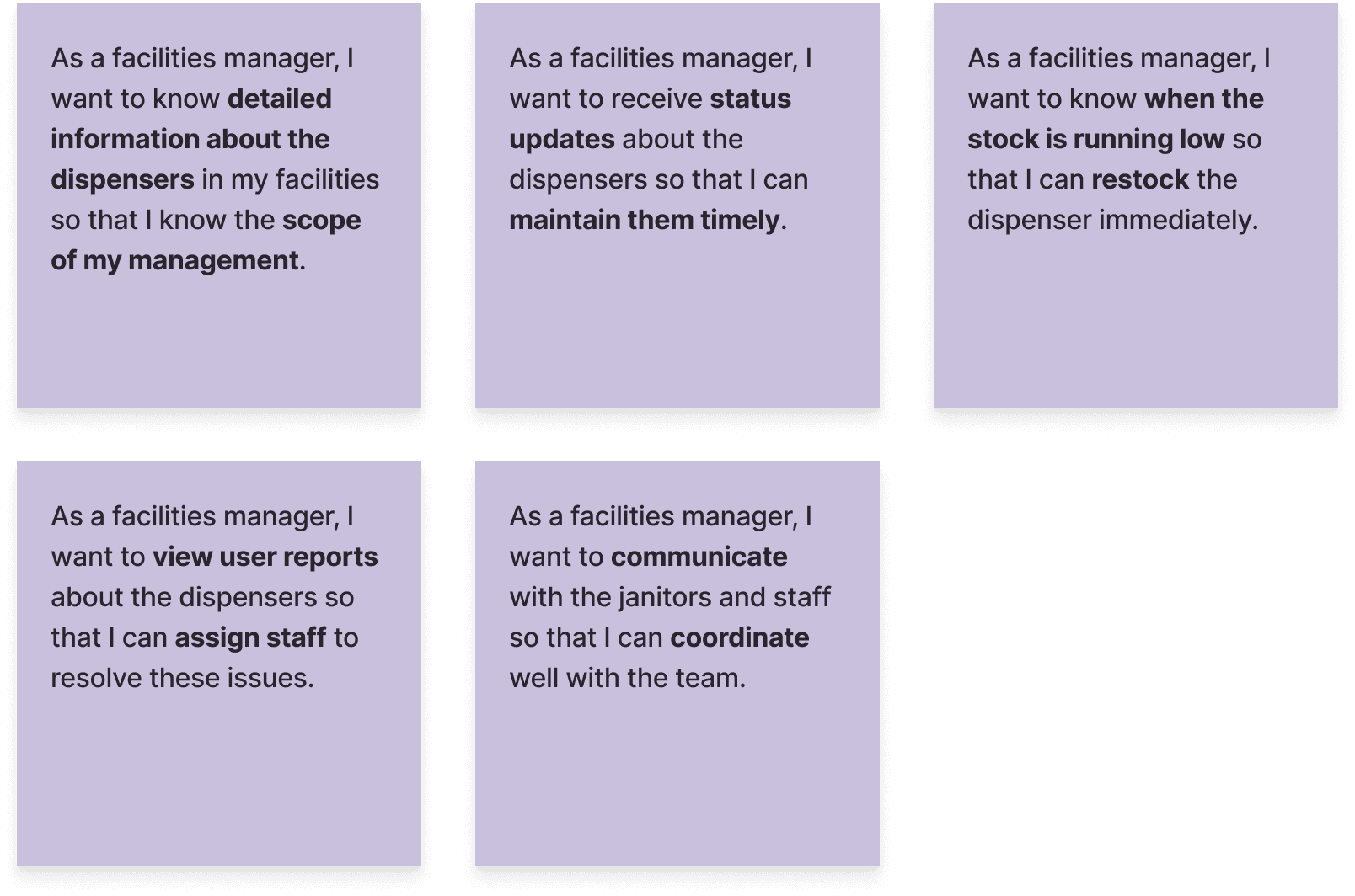
I created user stories not only for planning and scoping purposes but also to further identify what the users want with the mobile app and why.
User Stories
The four user stories served as a reminder for me to have conversations about what I’m trying to help the users accomplish and to build a shared understanding of these accomplishments with my team.
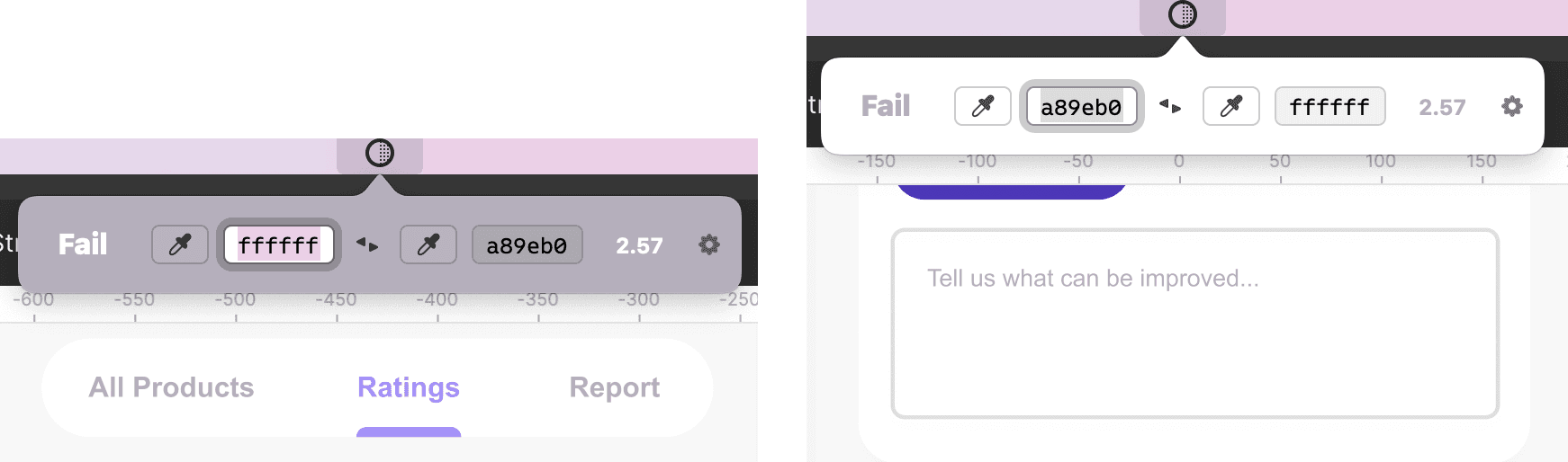
Once I had a better grasp of the user needs, three necessary navigation interfaces emerged:

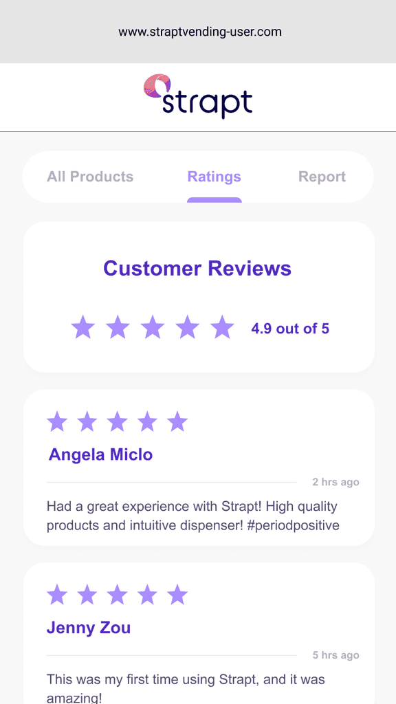
All products
Access the details and stock status of all the available products.

Ratings
View the ratings of the dispenser provided by previous users and leave ratings to help future users make vending decisions

Report
Alert management once a potential malfunction is discovered by the users.
This site map allowed me to visualize how pages should be organized, linked, and labeled. Empathizing with how the users would benefit from these pages helped me with the development of the site map.
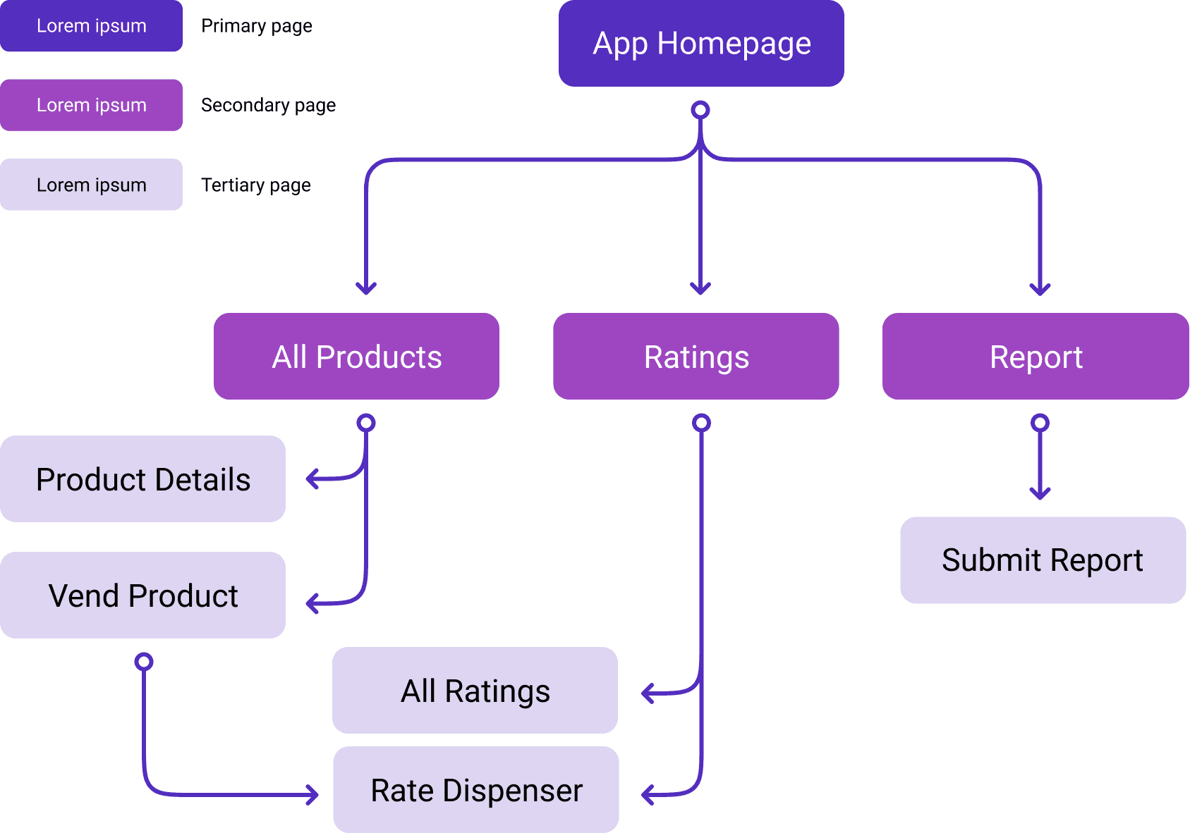
Sitemap
Using my site map, I drafted the user flows that helped to enhance the ease of movement through the mobile app. The user flow helped me see what options the user has on each page and if the routes available help the user accomplish a task innately and without wasting time. The user flows displayed below only showcased the transactions that would occur in which the users do not have the app downloaded on their phones, which was the primary scenario that all first-time users would encounter.
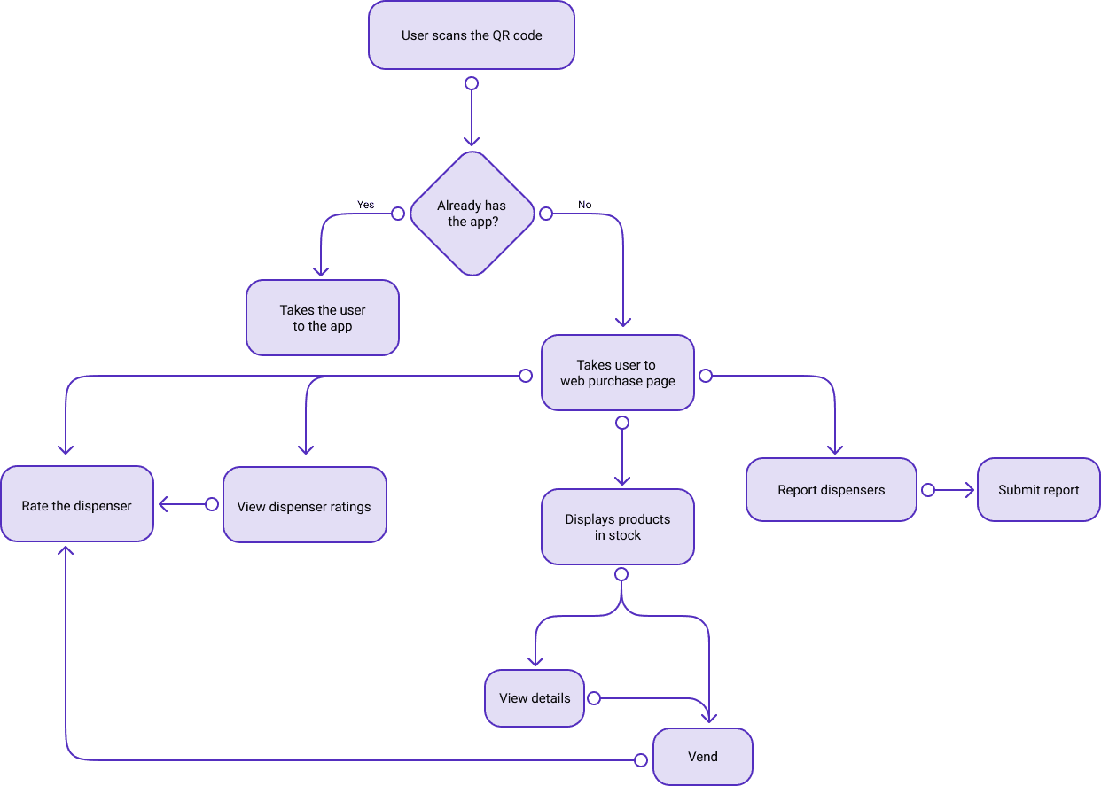
User Flows
As the ideation phase comes to a close, I presented my research findings and creative outcomes to our mentors and sponsors. During the Q&A session of the presentation, a sponsor raised the question of whether the team has done any research on the facilities managers. This was when the team realized that we have been missing a crucial part of the research, the facilities managers are the primary point of contact when it comes to maintaining, restocking, and repairing the dispensers. Without the support of facilities managers, it would also be impossible for the mobile app to obtain real-time data and resolve the malfunctions reported by the users. I understood the potential impact this research gap could have on the final product, so I immediately led the team to conduct additional research on facilities managers
Therefore, the product will not guarantee a satisfactory user experience without allies in facilities.
Facilities managers were chosen as the second target consumer as the team discovered the research gap. Their inclusion was due to the fact that recall from the prior user interviews, only 12.5% of the users reported the dispenser working properly.
As with the initial consumer group, I led and coordinated user interviews with more than twenty facilities managers across more than ten different industries—from local shopping centers and schools to sports arenas and international airports—in an attempt to better define the needs of both ends: users and administrators. The interviewees were recruited by me through the methods of cold-emailing through various company websites and cold-messaging facilities managers on LinkedIn.

Over the span of three weeks, I conducted 30-minute user interviews over Zoom, Microsoft Teams, and phone calls with 23 of the hundreds of facilities managers who have gotten back to me.
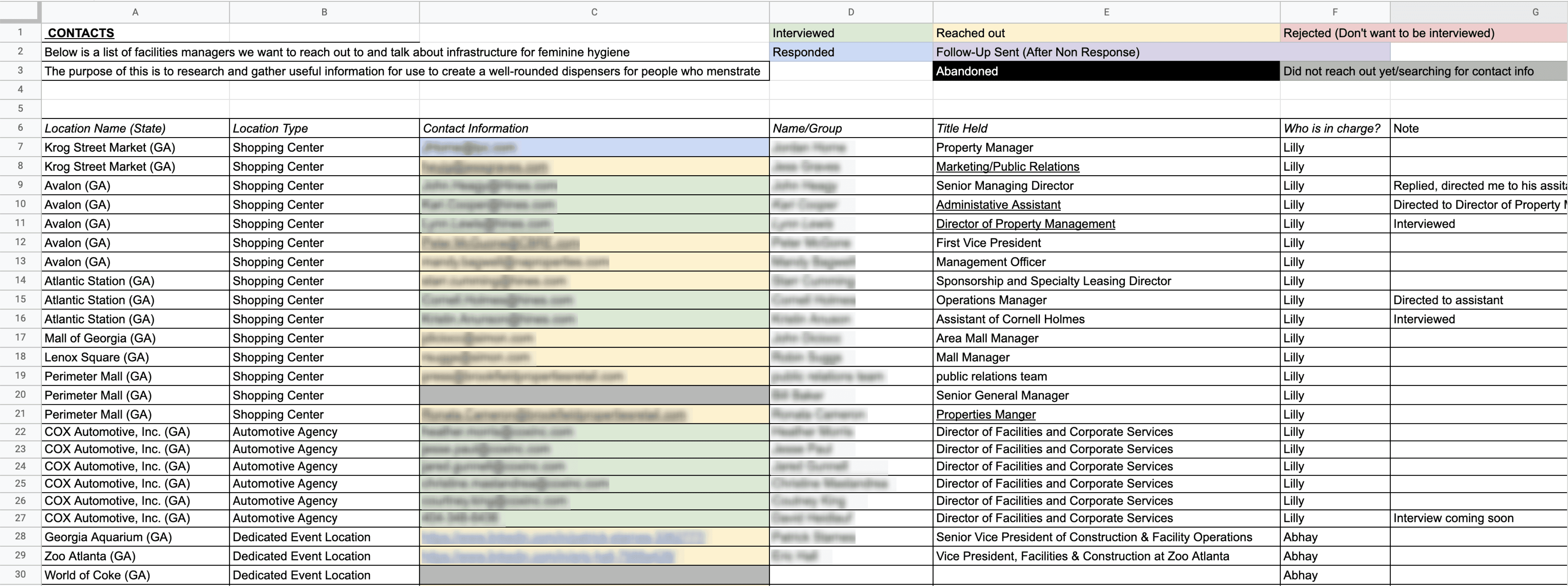
The spreadsheet used to track the progress of the interviews
I’ve gained valuable insights into how I can bridge the gap between the dispensers and facilities managers, therefore making the dispensers themselves also more desirable to the facilities managers.

Facilities managers are willing to support the current state of menstrual hygiene and product dispensers if all required tools and platforms are provided.
The majority of the interviews reflect a preference for contactless and cashless vending, for both the hygiene of public health and easy maintenance.
In bigger corporations, janitors directly manage and maintain menstrual product dispensers. Therefore, there is a need for a platform that allows janitors and facilities managers to both communicate among themselves and keep updated with the status of dispensers.
As the team unanimously agreed on including the facilities managers as our second target consumer, I performed a new iteration of brainstorming to address how the product will fit their needs.
Now, the problem at hand is how can the dispensers provide a way for the facilities managers to maintain them in a timely manner. After some thinking, I soon reached the solution of an admin app that can sufficiently aid the facilities managers to ensure consistent functionality and satisfactory stock of the machine.
I decided to also write the user stories for the admin app in order to create a well-defined product for the facilities managers as well.
User Stories
Similar to the user-facing app, I created a site map for the admin app based on the expectations that appeared from my user stories. There are four main navigations—home, profile, messages, and calendar—for the admin app, and for the MVP of the project, I chose to develop the home navigation further and focused on its three subpages:

Urgent
View all the dispensers that require immediate maintenance.

All Dispensers
View all the dispensers installed by the facilities.

Flagged
View all the dispensers flagged by the users (this will function similarly as a bookmark for facilities managers to easily refer to specific dispensers)

Search
Look up a dispenser by its number, location, or status.
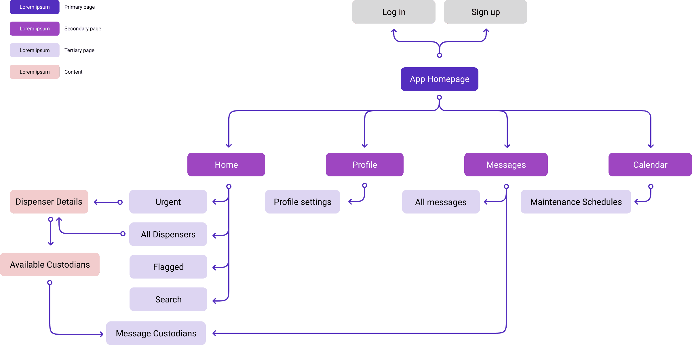
Sitemap
I then thought of the core functionalities of the home navigation and determined three red routes that users would most frequently take while on the home navigation. I created user flows for each red route which enabled me to map out the flow of the routes to ensure that the facilities managers would be able to grasp useful information in the easiest and simplest way.
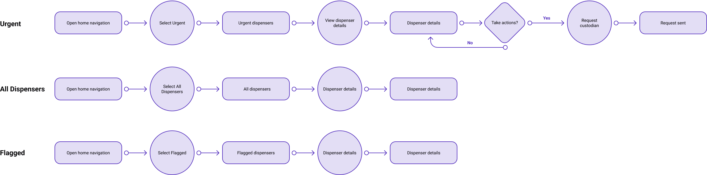
User Flows
After closing the loop between the maintenance of dispensers and facilities, I began sketching low-fidelity mock-ups for both the user-facing and admin-facing mobile app. The user flows helped me determine which screens the user needed to engage with and the best page layout for these screens. To create a seamless experience and feasible layout, I collaborated with the lead electrical engineer, who was in charge of the physical dispenser and the IoT technology.
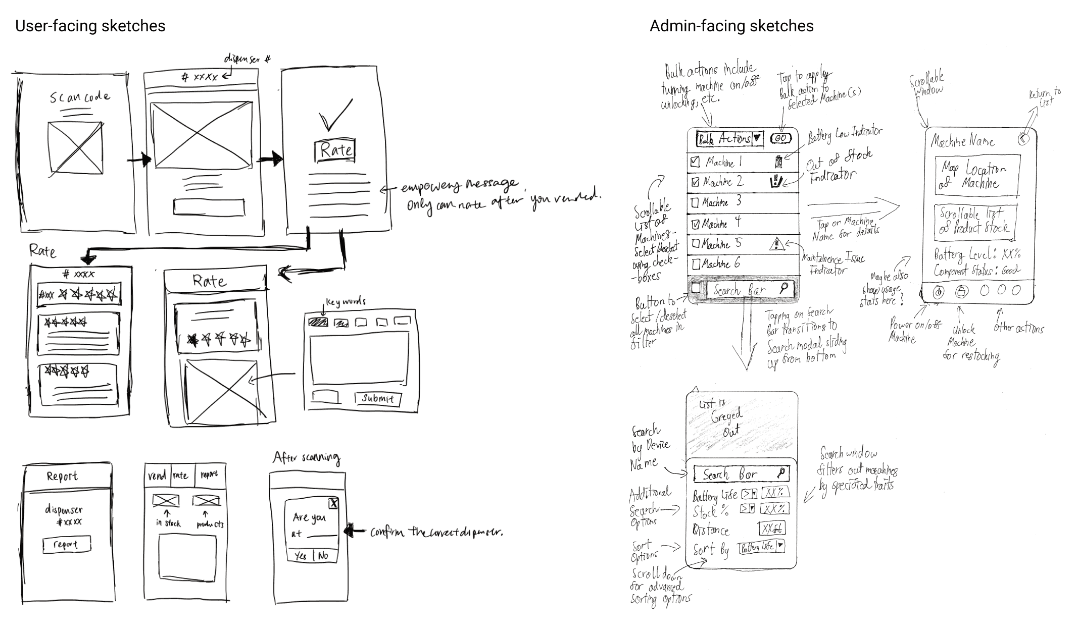
Sketches
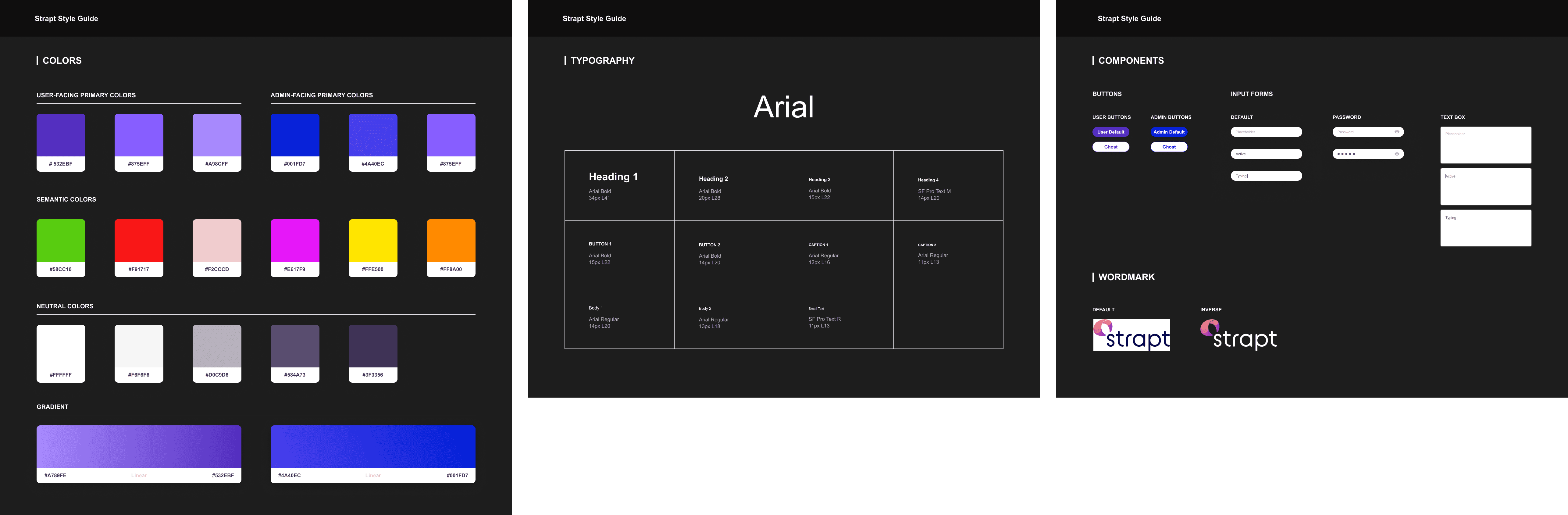
Style Guide


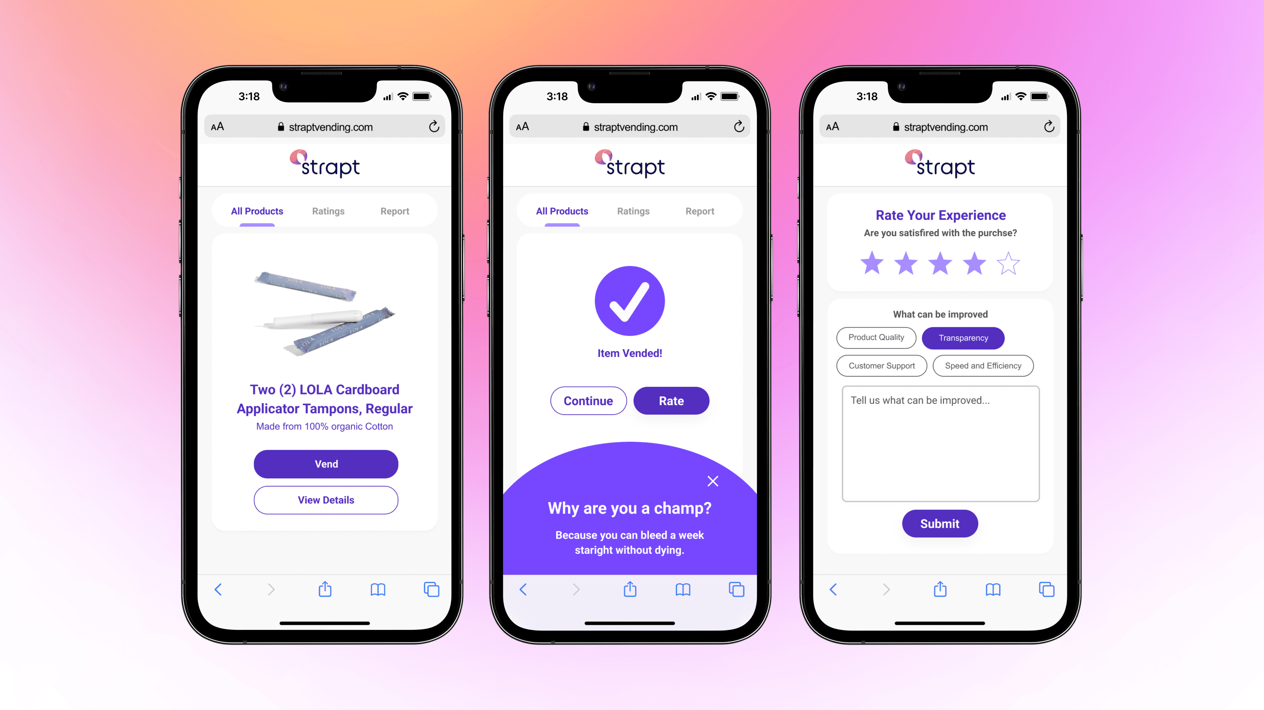
Since the final MVP pitch was coming up in a month, I led the team to de-scope the apps into websites and only implement the user-facing website for the purpose of the MVP.


Strapt is currently hosted by 20+ public spaces in Atlanta, locations include Ponce City Market, Atlanta International School, and Bobby Dodd Stadium.

The product is benefiting thousands of people who menstruate in the Greater Atlanta Area!