


I approached the challenge through secondary research, which was cost-effective for the short 2-week time frame and built a solid foundation for the project.

According to a 2022 Insider report↗, an average Costco consumer is a 39-year-old Asian American woman who’s married and earns $125,000 per year. Therefore, I decided to build my research around this demographic.
It is no surprise that Costco is one of America’s favorite places to shop. Still, the number of choices and the constantly changing layout are the main contributors to a primary pain point of Costco shoppers: buying more than they can consume↗. While most consumers come to Costco with a list of necessities they plan to purchase, they often get distracted while doing their bi-weekly scavenger hunt in the store. Though moving around the items is a great strategy for Costco as a business, it is not sustainable for people to keep overconsuming. Meanwhile, because of the various distractions, most shoppers spend longer than they wanted in the store, making a simple grocery run inefficient.

Although Costco does have a mobile app for users to quickly look up the stock in a specific store, there is no accessible way for the shoppers to collect a list of items they would like to get in-store, and not to mention there is no assistance within the app when it comes to navigating around the already confusing store. It was clear to me that there is a UX opportunity for improving the in-store shopping experience for Costco consumers.
After the secondary research, I led a brainstorming session with the team to discover how we can approach the problem. We used Zoom and Mural to share our ideas and synthesize the existing research.
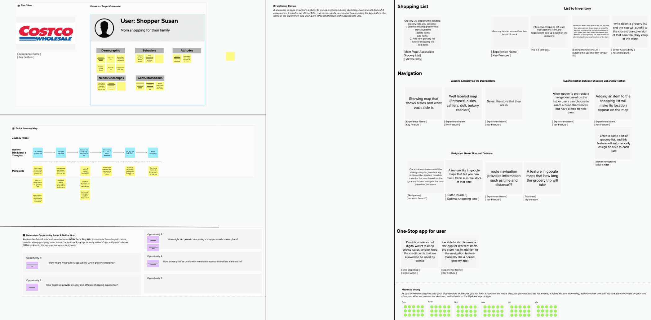
Our mural board for brainstorming
A deep understanding of a target audience is fundamental to creating exceptional products and answering the very important question of “Who are we designing for?”. A persona was very easy to create with the secondary research conducted beforehand, and with our persona “Shopper Susan”, the team could quickly empathize with the end-users.
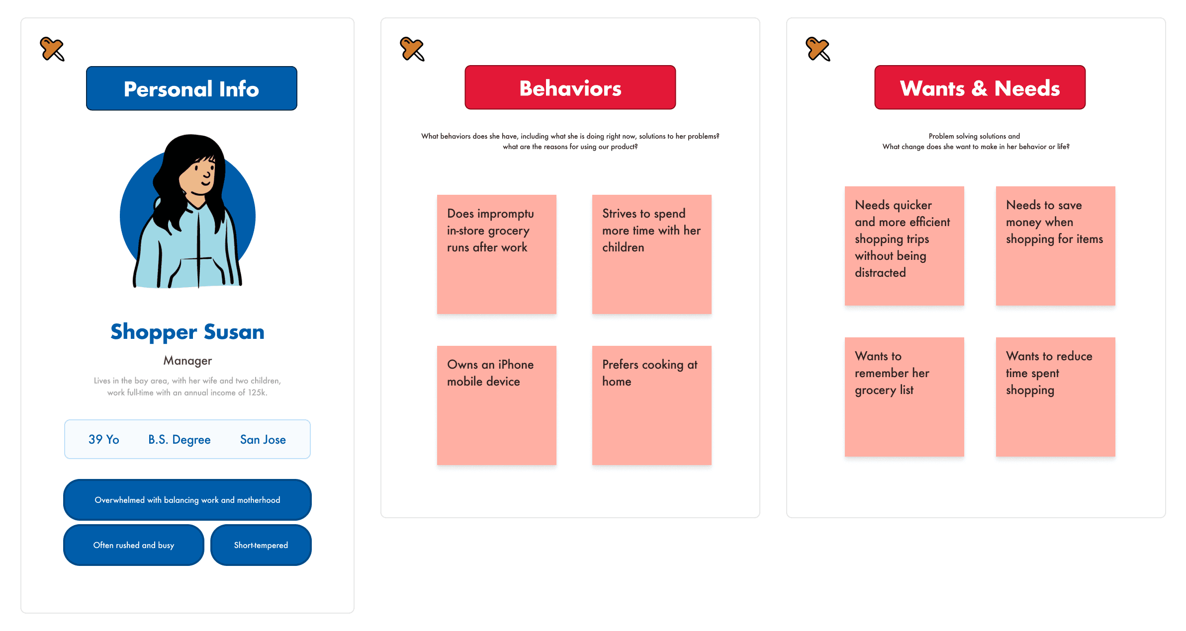
Persona
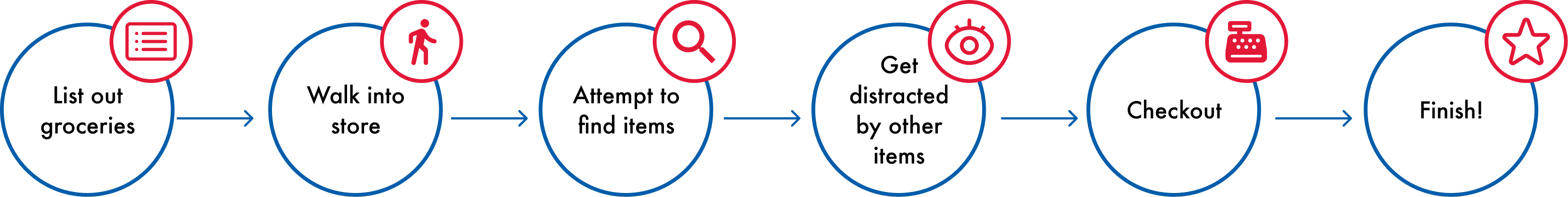
User Journey Map
User pain points were discovered through the user journey. Identifying and preventing these user pain points in the final solution was an essential step to a successful redesign.
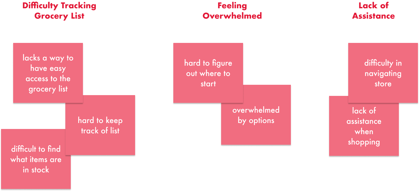
User Pain Points
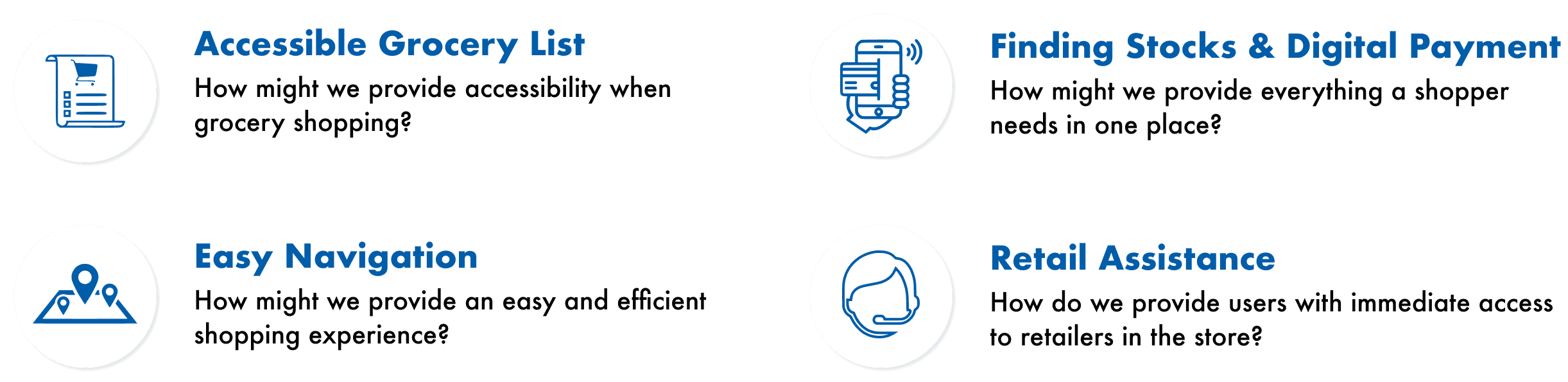
UX Opportunities
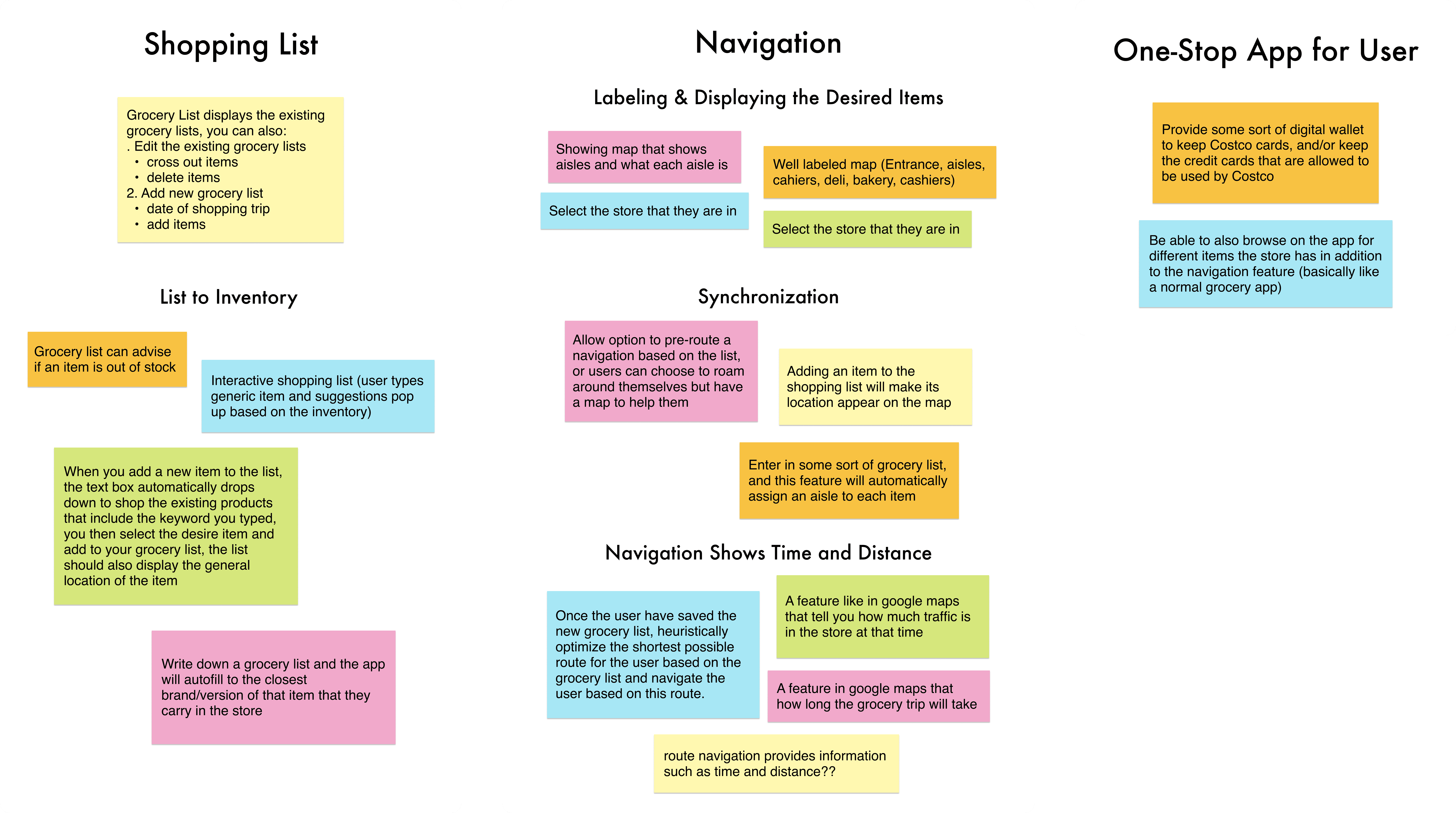
Affinity Diagam
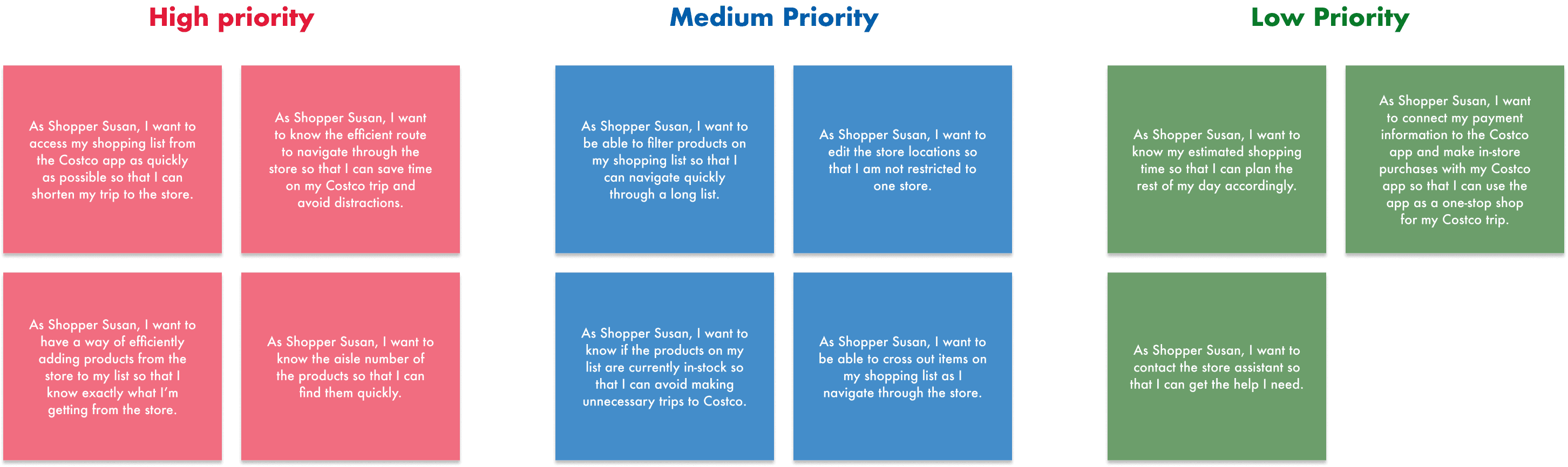
To achieve cross-team clarity of what features we are building and why are we building them, I created user stories for the features from in the affinity map. I also identified the priorities of each feature based on how directly it solves users’ pain points.
Moodboard
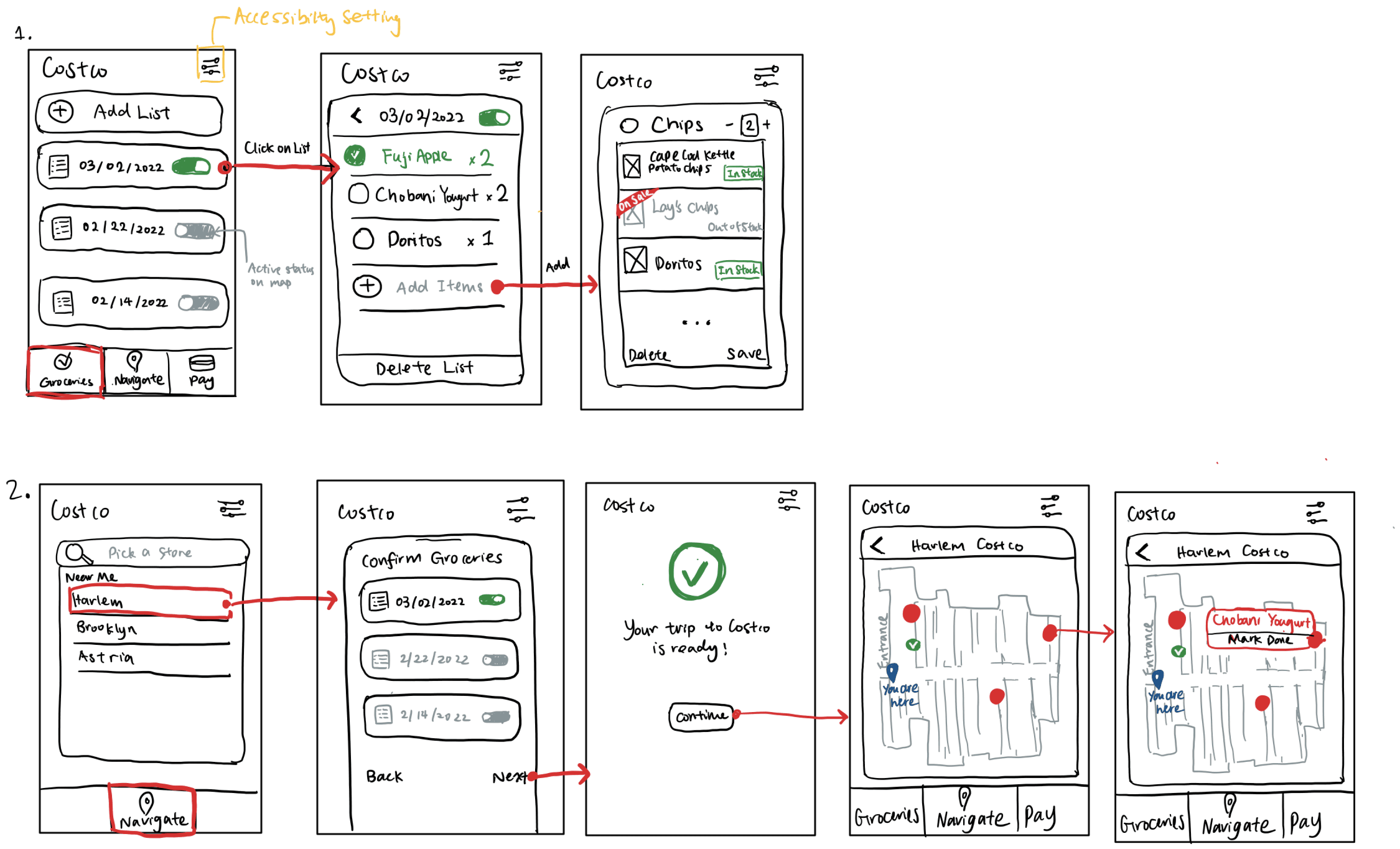
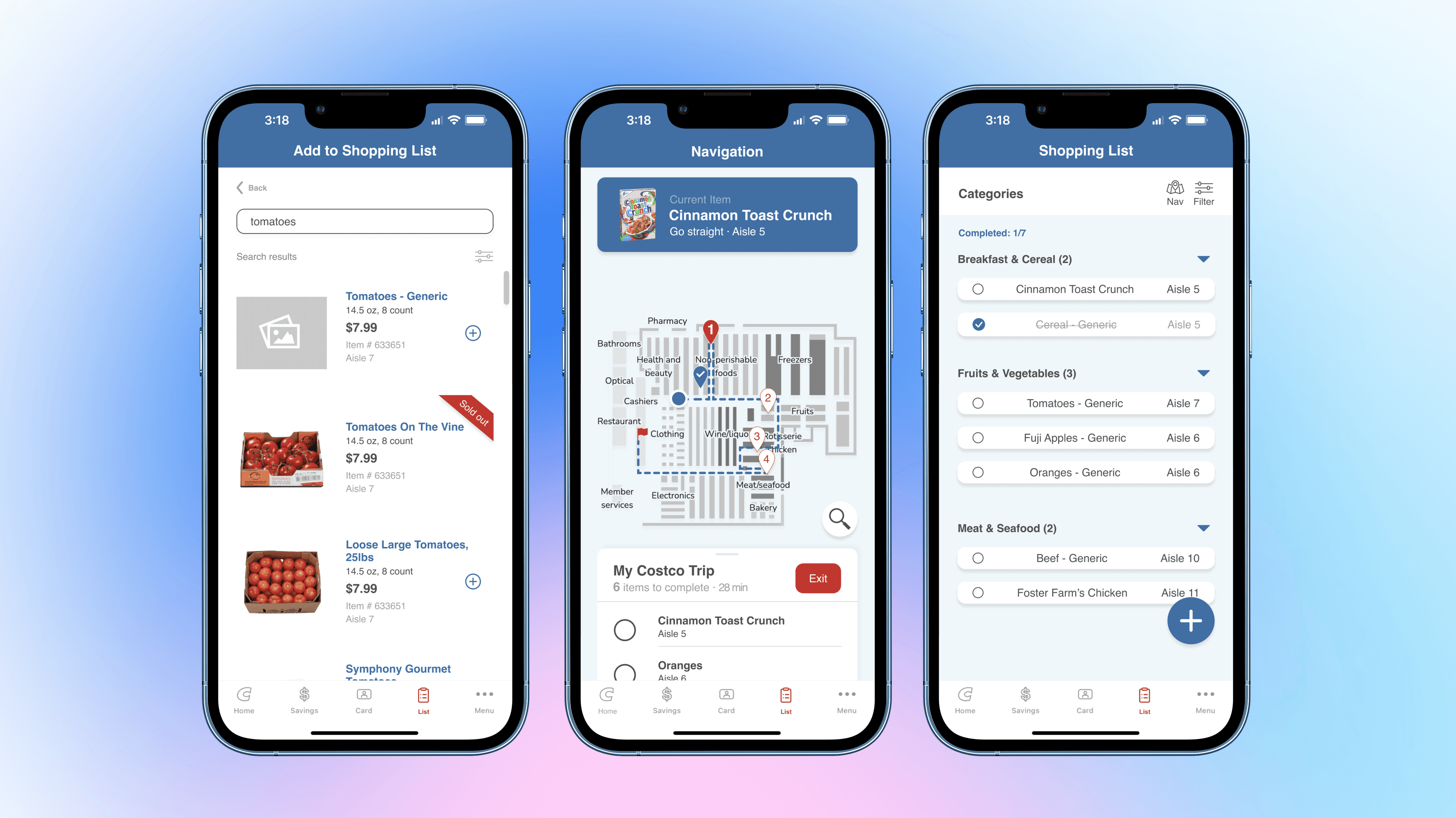
After synthesizing both of our ideas, we arrived at our final wireframes. We decided to include the navigation feature as a part of the shopping list feature. The shopping list will exist as a navigation item in the bottom tab bar of the app.

We’ve chosen to replace the “Warehouse” tab with the shopping list since the feature included under the Warehouse tab is already equally accessible through the homepage’s “My Warehouse” item.

The “List” tab will take the user to the shopping list page, which can be updated based on what products the user is looking for. The users can add items based on keyword searches.

The users can also delete or cross out products on the page as they shop in the store.

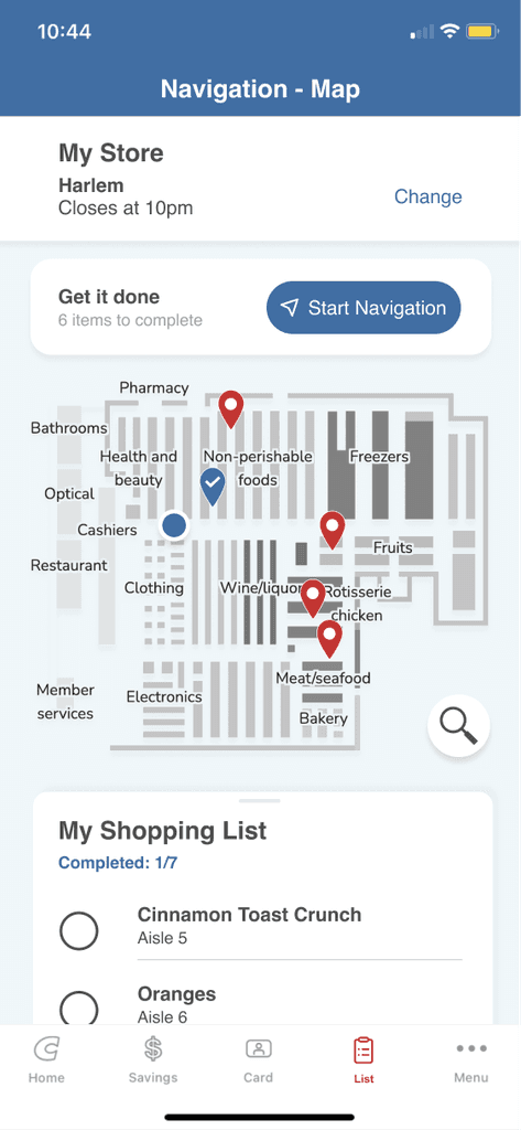
Once one or more products are added to the list, the “Nav” and “Map” features will be activated.

The “Nav” and “Map” features will function based on the users’ selected store, which can be changed from the “Nav” and “Map” pages, as well as the homepage.
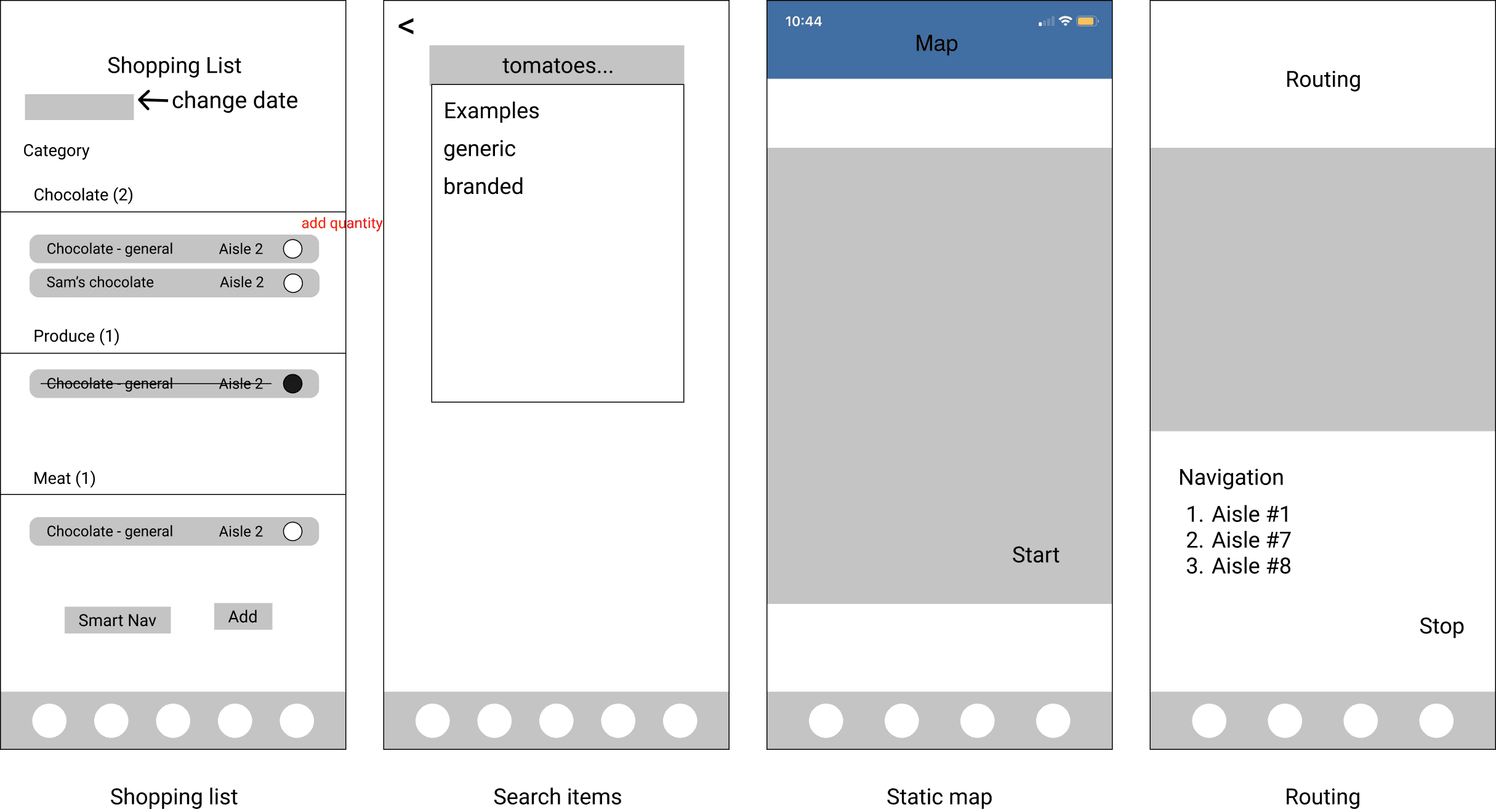
The design team then further developed the low-fi wireframes into hi-fi wireframes where I focused on developing the map and navigation pages, and the other designer focused on the shopping list pages. We reviewed everything we had created so far - persona, user journey, user pain points, UX opportunities, user stories, sketches, and lo-fi wireframes to come up with our final designs.
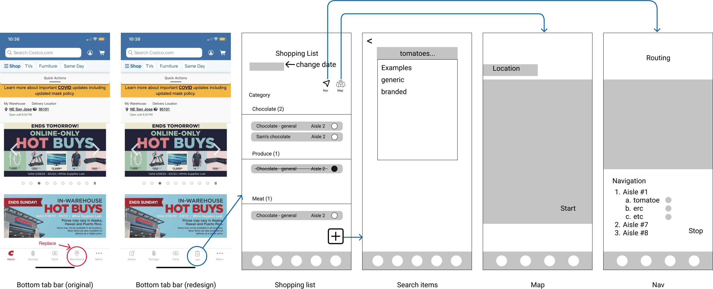
We communicated efficiently with the developers and program managers throughout to ensure we meet the user needs while executing practical designs, it was a "wireframe, iterate, re-wireframe" type of process that involved the entire team.
Together, we went through 3 rounds of iterations by the end of this stage before achieving the final designs.
The prototype is the best way to present what the final product would look like and how it would work to the stakeholders. We put our designs into a clickable prototype on Figma, where I primarily worked on prototyping the interactions on the navigation screens, and we pitched our redesign to our mentors. Watch the video below for an in-depth walkthrough of the navigation portion of the prototype or use this Figma link↗ to interact with the prototype yourself.
Since the development team was involved throughout the process, they were familiar with the entirety of the project. Along with the deliverables, we made handoff annotations notes regarding interactions, element spacing, and font sizes, and included a UI component library for the developers to refer to. Overall, the development process was seamless with great communication.

User testing: this will give us helpful information and feedback from users on what features we can prioritize, improve more, or what features we could implement next, as well as the user-friendliness of the existing redesign.

Client Collaboration: ideally we would want a redesign to be integrated into the existing Costco app, so we would like to maintain a relationship with the Costco organization.

Prioritize features: for the next iterations, we would be prioritizing the features that were not included in this iteration, such as requesting a digital assistant through the app.

Untitled Leadership
Being a leader regardless of my role. Although I was only one of the two UX designers on the team, I did not refrain from guiding the rest of the team through the process. Since everyone was fairly new to the industry, I took the responsibility of introducing them to the UX design process and led the team to participate in the brainstorming, ideating, and iterating sessions.

Collaborate and Communicate
Some of our best designs came about when I and the other designer were able to work collaboratively on a design together. Since we were living in two separate time zones (PST and EST), it was important for us to communicate often and schedule times to meet that work for both of us. A lot of great ideas from the final prototype were brought up during our many virtual conversations. Great communication also made us closer, sometimes we also just stay on the call and have a fun talk about life, which is always amazing.